On March 29th, Nokia announced a new brand strategy and design system at MWC 2023, marking the company’s entry into a new stage. The new brand strategy includes a fresh and clean minimalist style, and the new design system is called Nokia Pure.
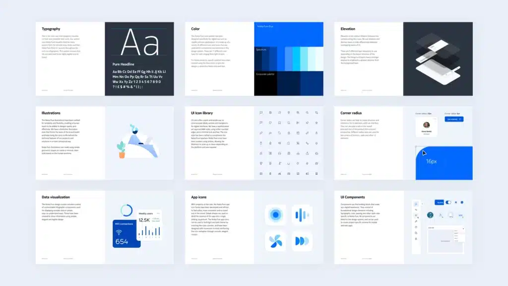
According to reports, Nokia Pure is a flexible and future-proof design system created by Nokia. Specifically, this flexible and future-proof design system, created by Nokia, includes basic elements, components, templates, and guidelines. All of them work together to achieve a fresh and clean minimalist style for Nokia digital products that aligns with the new brand look and feel.


UI icons
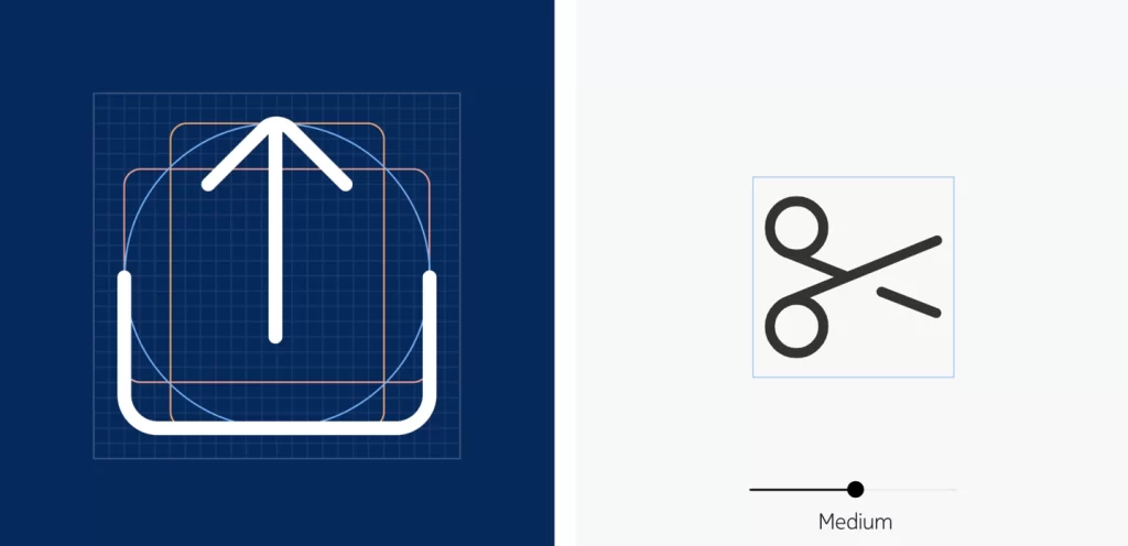
One of the major features of Nokia Pure is its UI icons. These icons provide a quick and easy way to communicate labels, actions, and metaphors of a digital interface. Moreover, Nokia crafted the Nokia Pure icons with a sophisticated yet approachable style. They have softly rounded edges and a minimalist look, complementing the consistency of its fonts used in the user interface. Additionally, Nokia Pure icons use strokes that can scale up or down in thickness, providing ultimate flexibility and visual sophistication.


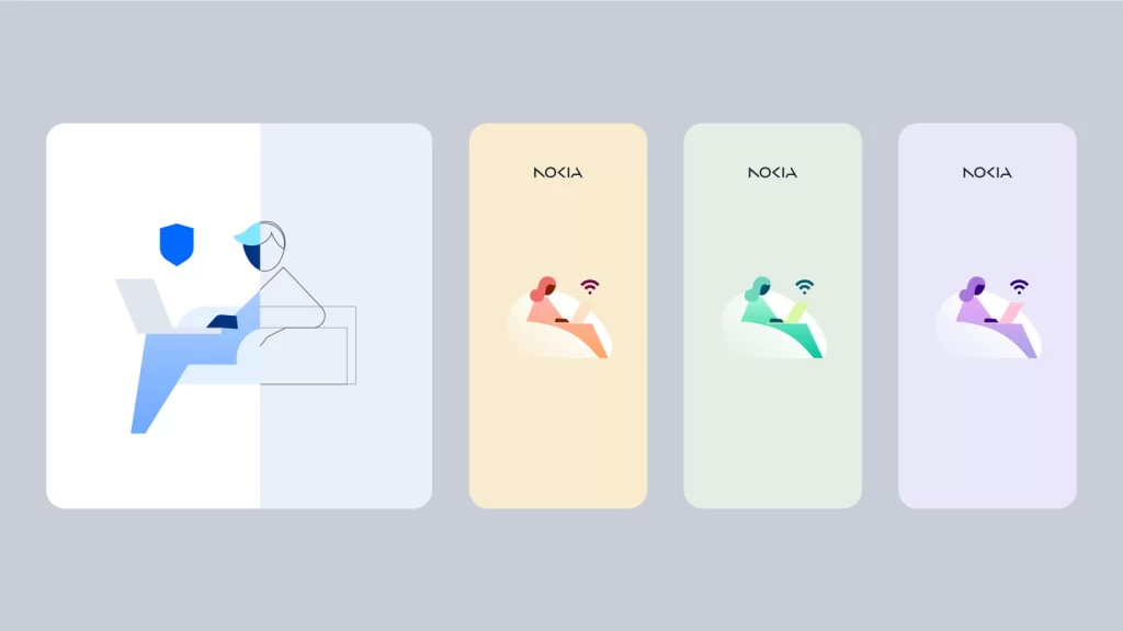
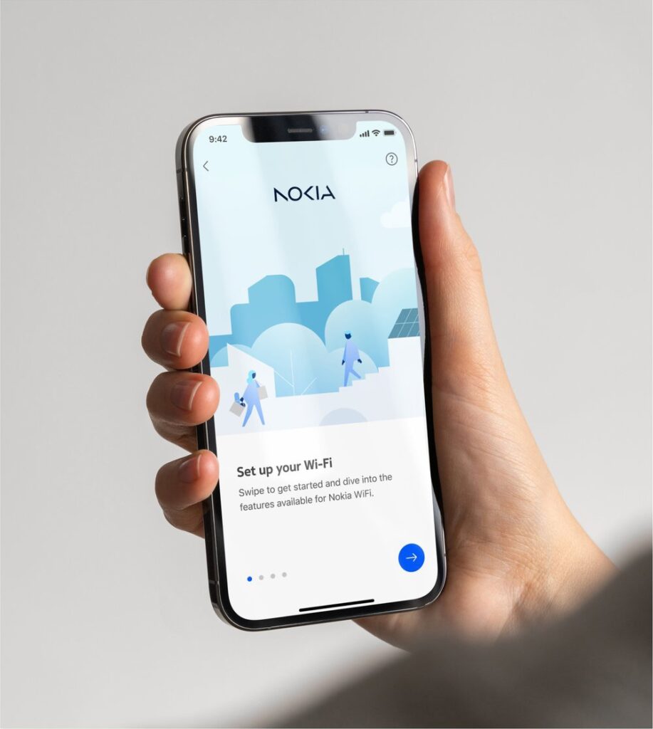
Pure illustrations
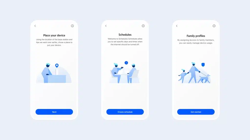
Another feature of Nokia Pure is its illustrations. These are clean and flexible in design, creating a human feel through suggestion, negative space, and abstract geometric forms. The use of interchangeable elements and the abstraction of gender and skin tone helped keep the illustration inclusive, allowing it to resonate with a broad audience, while still effectively providing Nokia designers with a flexible, functional toolkit with personality.


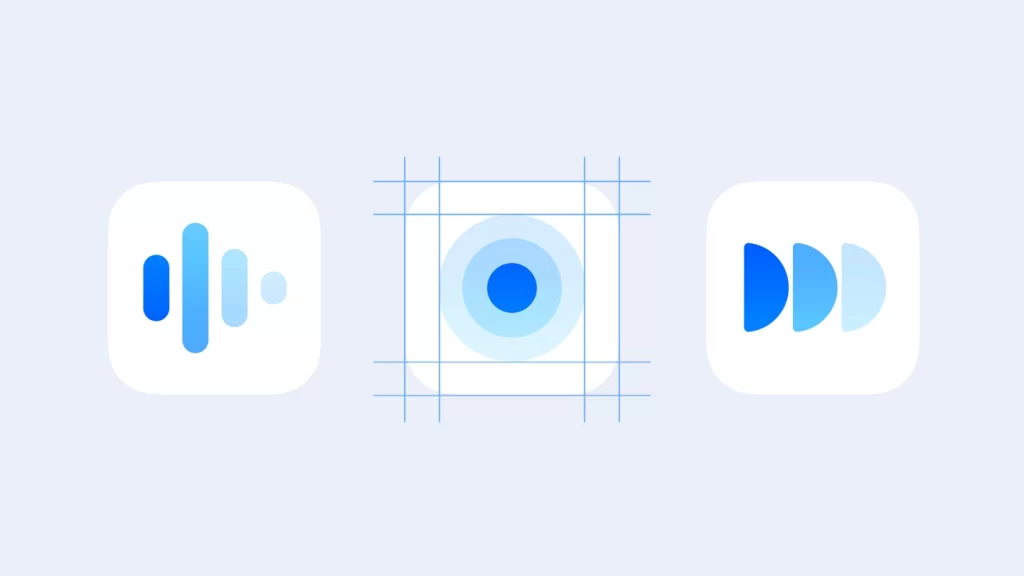
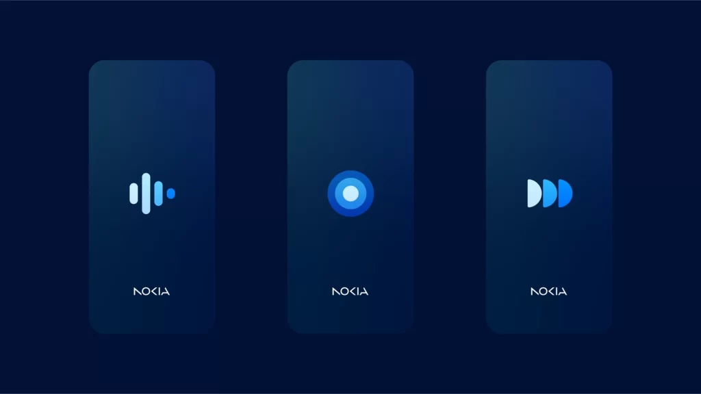
App icon
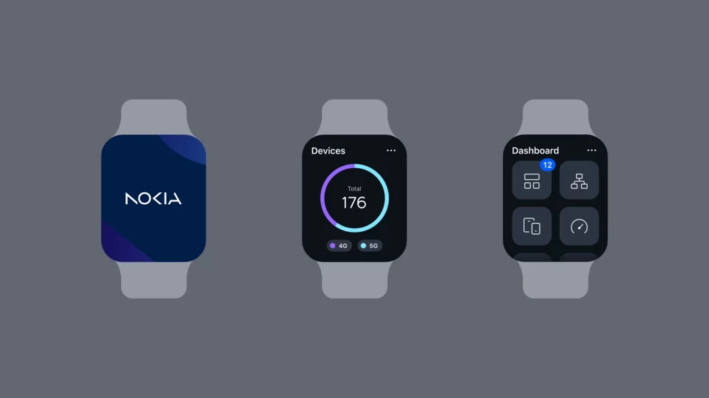
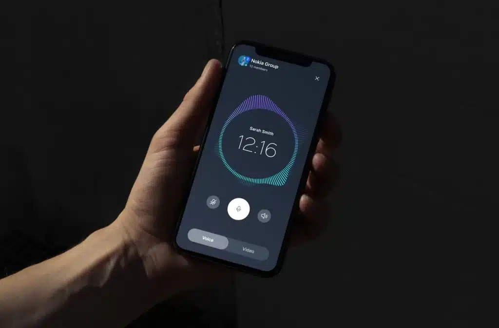
To create a striking visual mark, Nokia has developed and refined the Nokia Pure App icon collection, using simple shapes to distill the essence of the app. The result is a softer and more consistent design. The Nokia Pure interface design reinforces the simplicity of the brand with a smooth and elegant visual language running through the user interface in a light and dark theme in every detail.


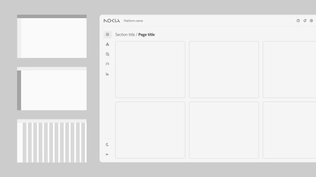
Pure data
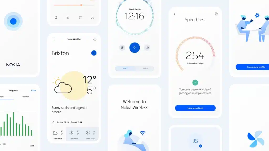
Furthermore, Nokia Pure also includes a range of customizable infographic components for displaying complex data in an easy-to-understand manner. Nokia Pure responsive web templates can use these components to create powerful data dashboards. Users can adjust them to meet their needs across a variety of environments, use cases, and device types.The end result is a beautiful and functional interface design that aligns with Nokia’s new brand and meets the needs and goals of users.


The Nokia Pure official website is now online, showcasing the new design system in all its glory. However, it is not clear whether this design will be used in HMD’s new Nokia machine.
Read More: Nokia T21 appeared on retailer’s site ahead of launch
The unveiling of Nokia’s new Logo and design system has received mixed reactions on the internet. But some users love the simplicity and elegance of the new design, while others feel that it lacks creativity and originality. Many have praised the use of strokes to create Nokia Pure icons, citing their visual sophistication and flexibility. However, some have criticized the lack of color and variety in the design system.

Overall, the new Logo and design system mark a new chapter in Nokia’s brand strategy. Nokia’s focus on simplicity and flexibility aligns with current design trends. The new system offers a functional and beautiful interface for users. Whether it resonates with Nokia’s target audience is yet to be seen.